GAHEL | GeoAI for Health Equity Lab
Grounded in spatial science. Driven by human equity. Built with authentic editorial imagery, consciously moving away from synthetic, AI-generated visuals
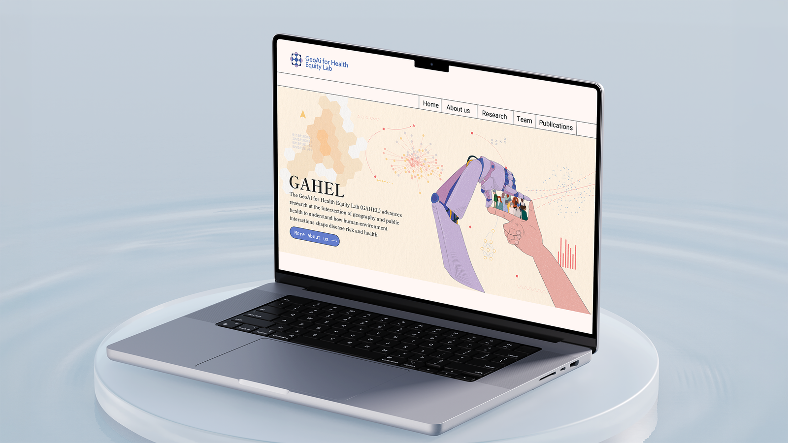
Minimalism and surrealism
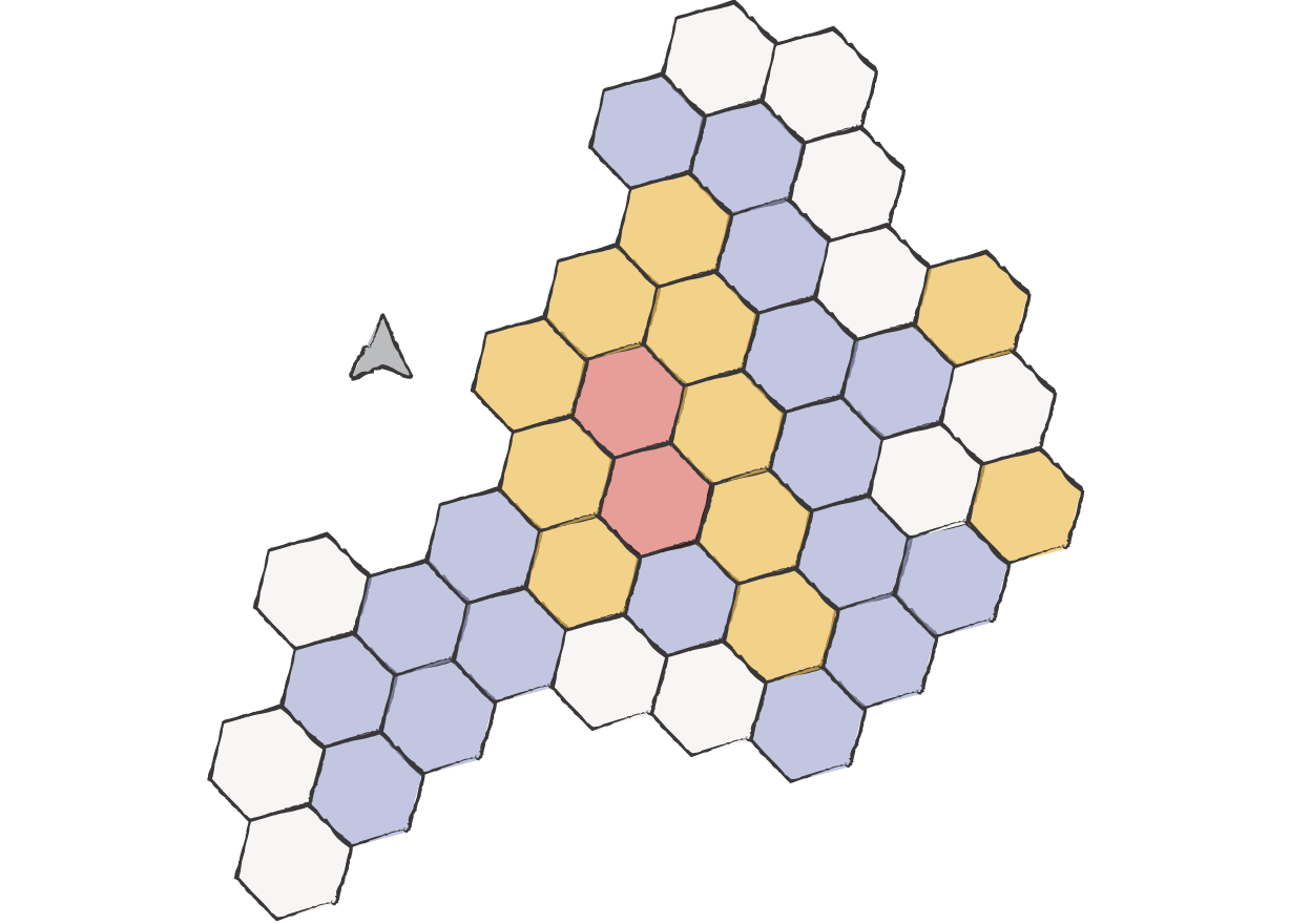
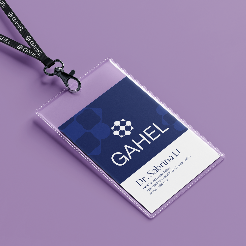
For the GAHEL project, the challenge was to communicate geography and data science without falling into the trap of generic, sci-fi graphics. We created a vibrant visual identity that respects negative space, utilizes a coherent color palette, and features a touch of hand-crafted lines. Together, these components establish scientific credibility and trust.
Organic and human
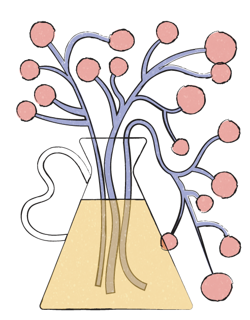
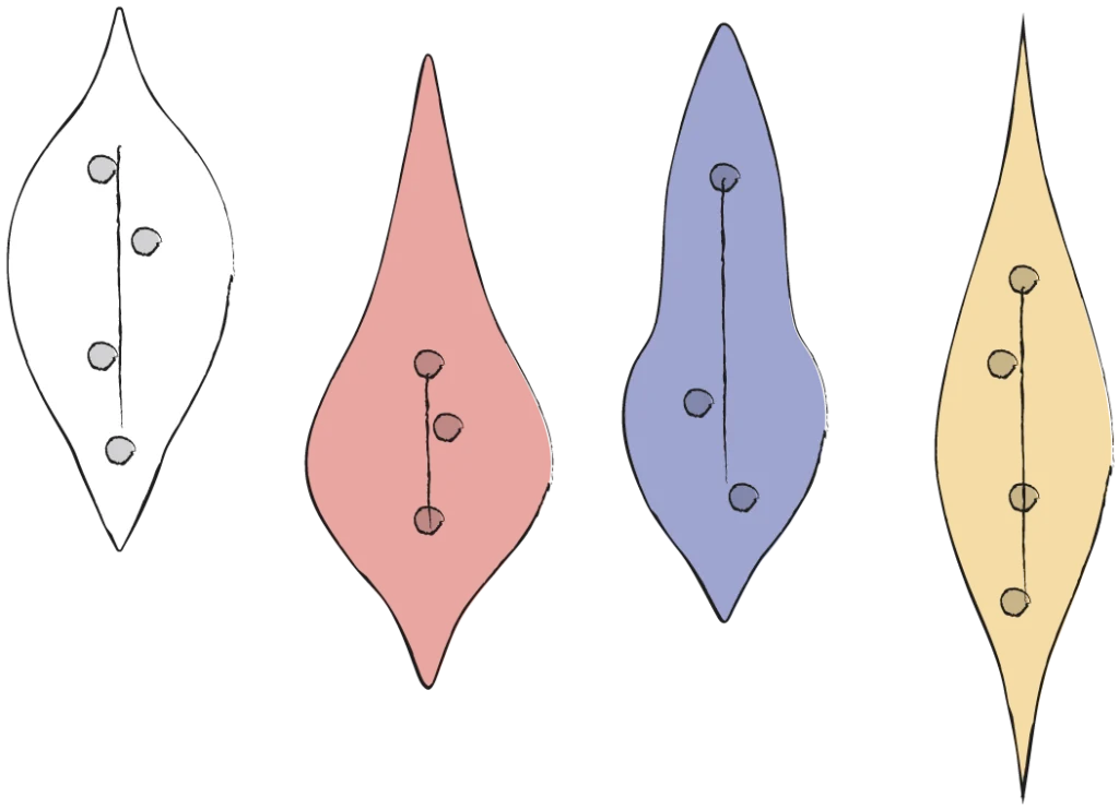
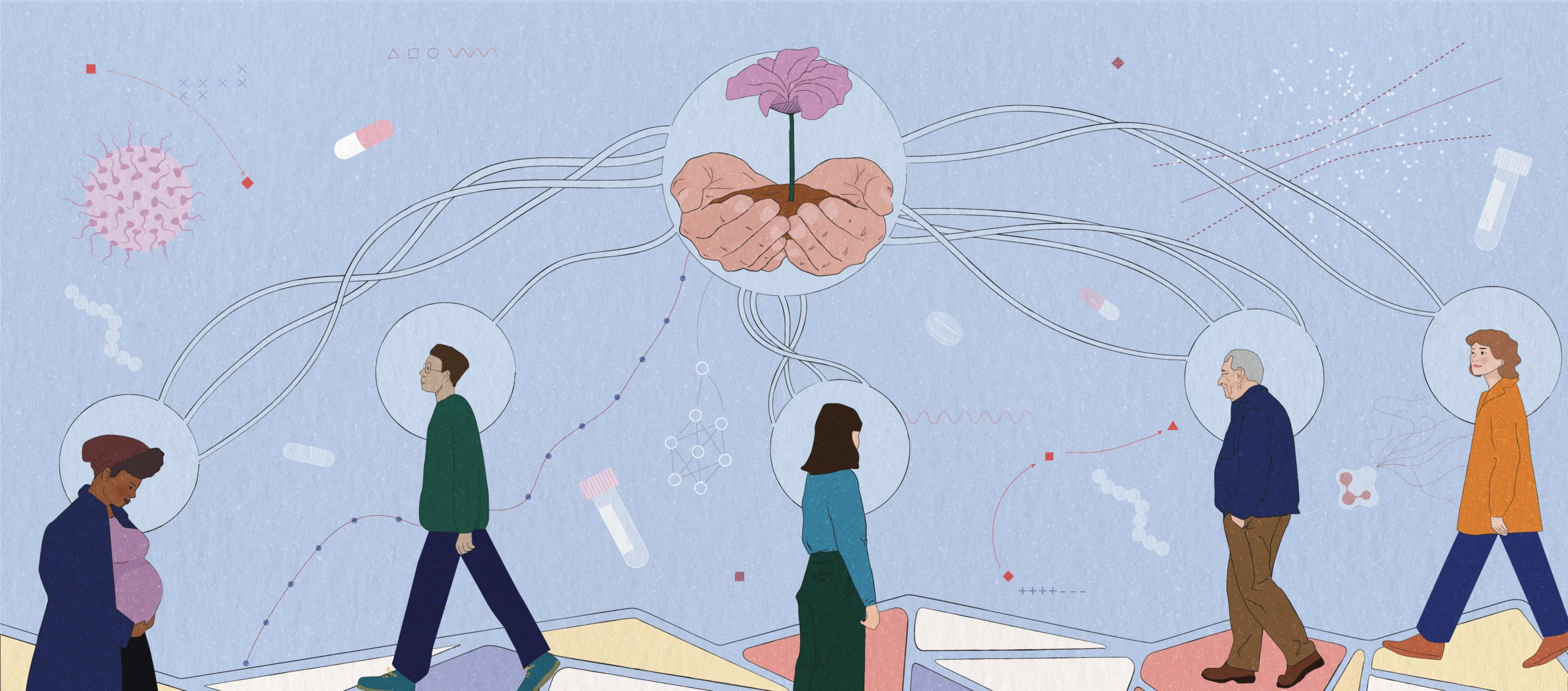
For this project we used a touch of hand-crafted lines, by overlaying organic, hand-draw textures alongside technical spatial structures, the design visually communicates that health equity represents real, lived human environments.

Mapping equity
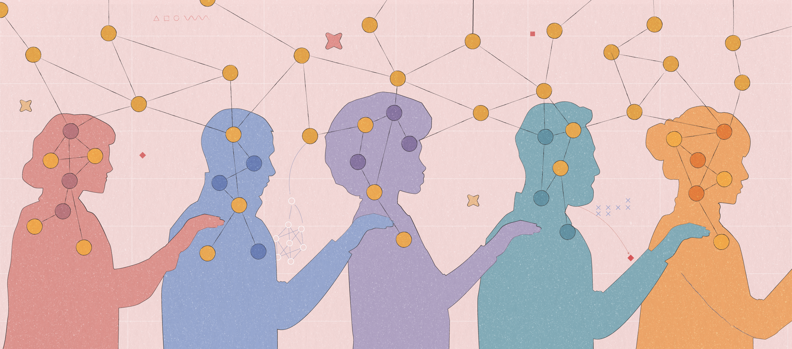
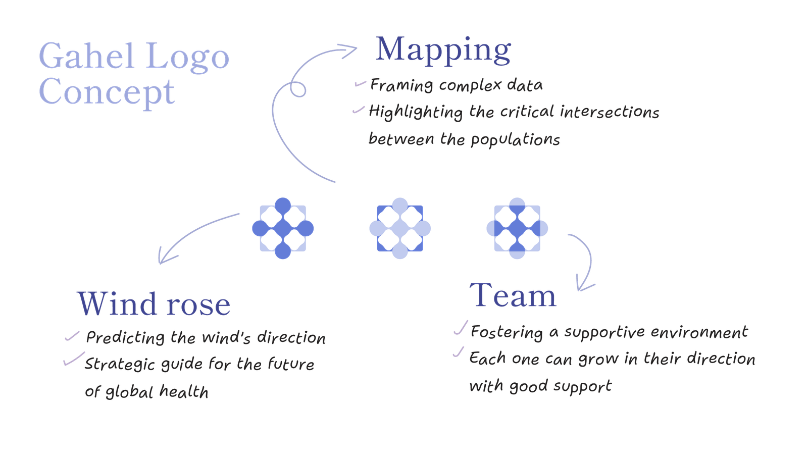
GAHEL uses GeoAI to bridge spatial data and public health, with a core mission to reduce health inequalities. Their visual identity should reflect this human-centric purpose, clearly communicating: “We use spatial mapping to guide public health through a supportive, collaborative team environment.”
To achieve this, we moved away from standard high-tech neon blues and dense greens. Instead, we introduced a warm, balanced palette that reminds the viewer of the reality behind every data point or machine learning model: a human community, a geographic landscape, and a real-world health challenge.