
10 Essential Design Principles to Improve Your Grant Proposal Figures

Jacqueline Tida
7 min read

Grant reviewers are exhausted. When they open your proposal, they have likely already parsed three or four dense applications, have five more waiting, and it is fast approaching midnight.
In a wall of text, strategic and well-designed figures do more than look good, they reduce cognitive load, build immediate credibility, and make your core hypothesis to jump off the page. Here are 10 foundational design principles to improve the readability of your grant figures and guide reviewers effortlessly through your narrative.
Part one: Layout & Flow
Layout and flow are core design partners. Layout is the structural arrangement of visual elements, while flow is the invisible path the viewer’s eye follows across the page. Together, they dictate what a reviewer notices first, second, and last. When executed correctly, high-impact layout and flow highlight key facts, reduce reading fatigue, and make your core arguments clear in seconds.
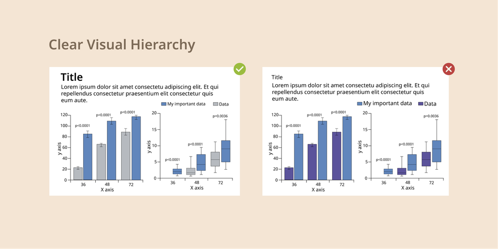
1. Establish a Clear Visual Hierarchy
The Concept: Arrange elements so the reviewer’s eye naturally focuses on the most critical scientific takeaway first.
How to do it: Scale elements by importance. Use larger font sizes, bolder weights, or selective color pops for key takeaways, primary data points, or central mechanisms.
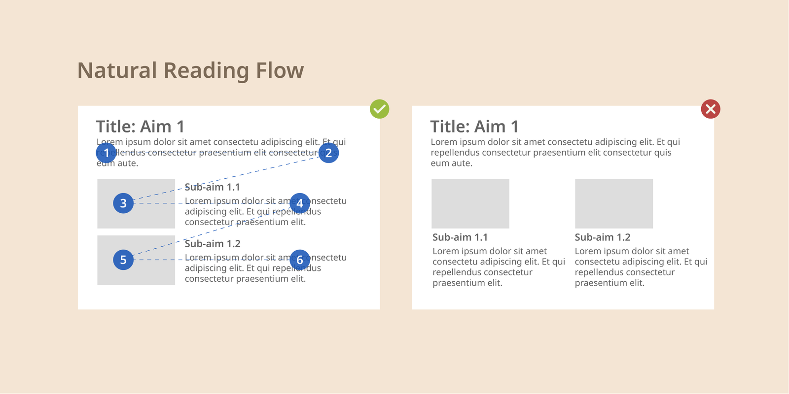
2. Design for Natural Reading Trajectory
The Concept: Western audiences naturally read from left to right and top to bottom.
How to do it: Arrange multi-panel figures or step-by-step experimental workflows in a clear “Z” or “S” pattern to guide the viewer smoothly through your narrative without visual backtracking.
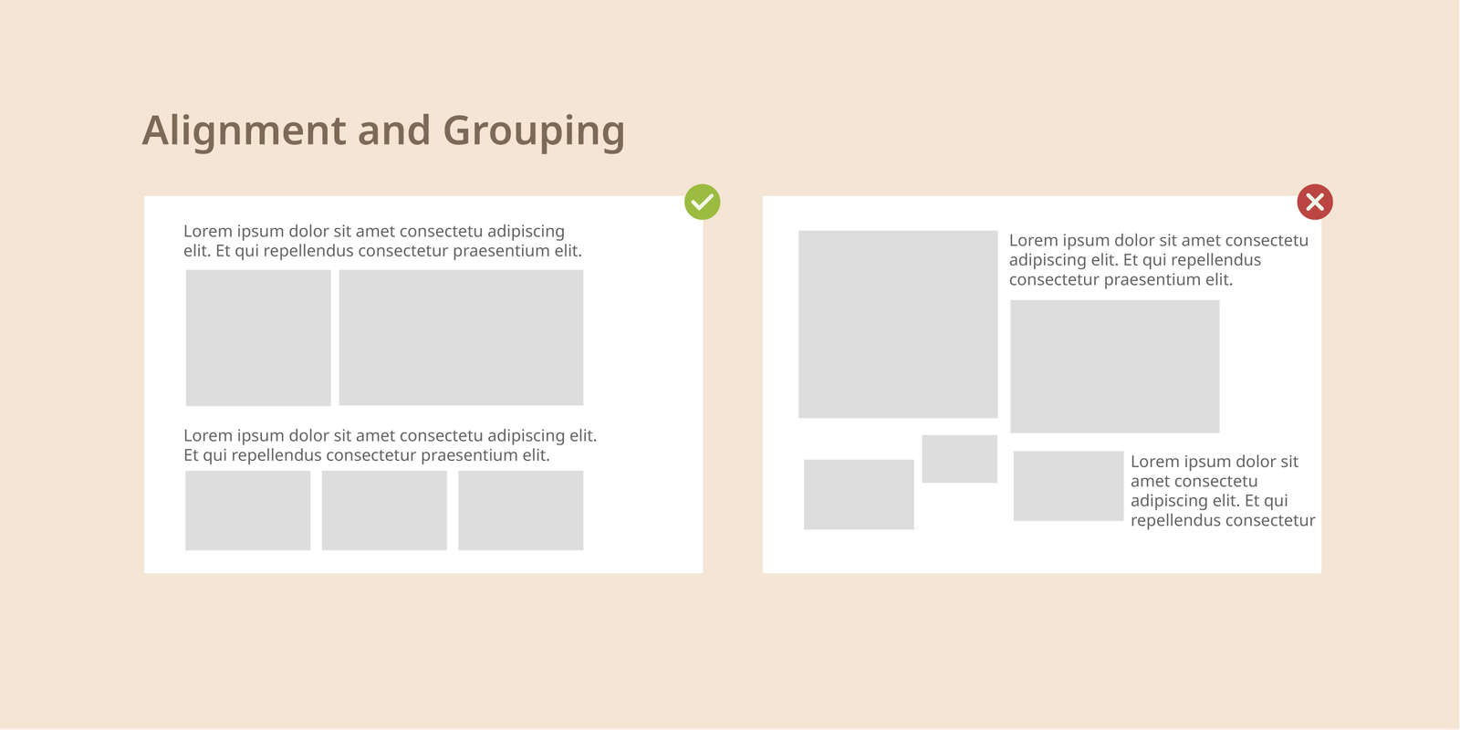
3. Align and Group Elements Intentionally
The Concept: Arbitrarily placed shapes and floating text boxes make figures look disorganized and increase mental friction.
How to do it: Use layout grids to align borders, axes, and text. Apply proximity principles: keep related data, arrows, and labels close to each other so the reviewer instantly understands their connection.
Practical Layout Tools to Apply:
Bullet Points: Break complex descriptions inside figures into concise, bite-sized points.
Callout Boxes: Place core aims or hypotheses inside lightly shaded containers to anchor the reviewer’s attention.
Descriptive Headers: Use clear, action-oriented titles for figure panels so reviewers instantly understand the takeaway of each section.
Need Grant-Ready Figures Without the Stress?

We specialize in crafting custom, high-impact scientific illustrations and grant figures tailored specifically for university labs and Principal Investigators.
Part Two: Color & Contrast
Color and contrast establish visual hierarchy and direct attention. Strategic color choices create intentional focal points, while proper contrast ensures text and pathways are legible under any viewing condition. A cohesive color palette across your entire grant proposal signals polish, organization, and precision.
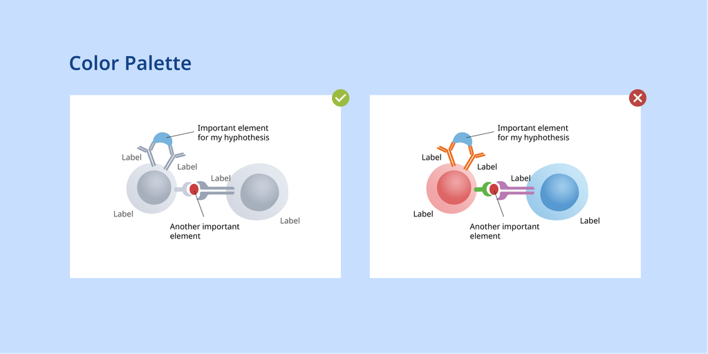
4. Limit Your Color Palette
The Concept: Too many colors create visual chaos that distracts from core findings.
How to do it: Choose two or three primary colors for the entire figure. Reserve bright, saturated colors exclusively for critical data points, active nodes, or key results. Use neutral, muted tones (grays or muted earth tones) for background elements, context, and secondary pathways.
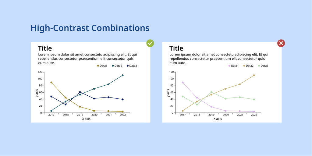
5. Ensure High-Contrast Combinations
The Concept: Low-contrast elements blend together, making labels and fine details frustrating to decipher.
How to do it: Default to dark text on light backgrounds. Ensure chart lines and data markers stand out sharply against grid lines. Avoid low-contrast pitfalls like light yellow text or pale yellow bar charts on white backgrounds.
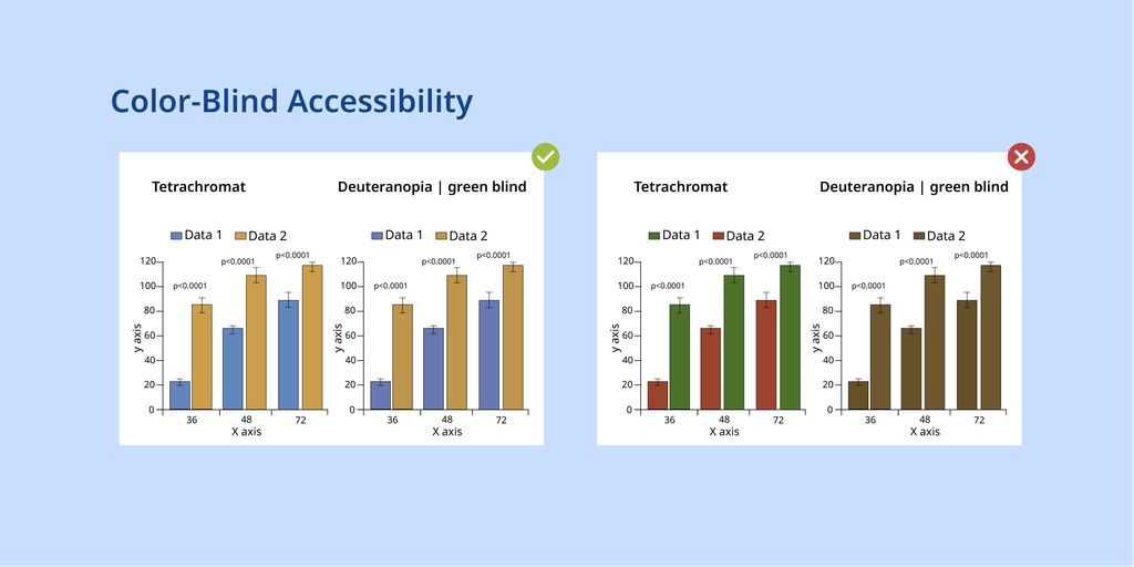
6. Design for Color-Blind Accessibility
The Concept: Red-green color blindness affects roughly 8% of men (1 in 12) and 0.5% of women (1 in 200). There is a significant chance your grant reviewer will struggle to differentiate unoptimized color pairs.
How to do it: Never rely solely on red-green pairings to convey contrast or difference. Use accessible combinations like blue and orange, or incorporate distinct shapes, line styles (dashed vs. solid), and pattern fills alongside color to separate data series.
Recommended Color Tools:
Part three: Simplicity & Polish
When fitting specific aims, working hypotheses, and preliminary data onto visual panels, it is tempting to fill every square millimeter of space. However, clean design is fundamentally more persuasive. The human brain processes clean lines, intentional negative space, and uncluttered visuals with significantly less cognitive effort. A simple, focused graphic communicates core rationale far better than a crowded panel.
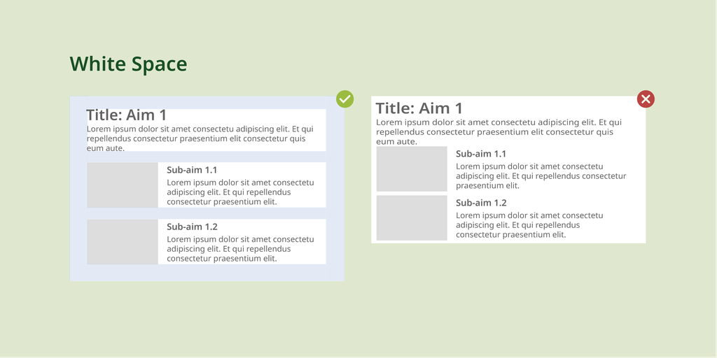
7. Embrace Strategic White Space
The Concept: White space (negative space) is the open area around text and graphics. It gives the reviewer’s eyes room to rest and process information.
How to do it: Avoid crowding containers, text, and pathway arrows together. Maintain consistent padding around every element. Resisting the urge to fill every blank space makes your key findings look clean and deliberate.
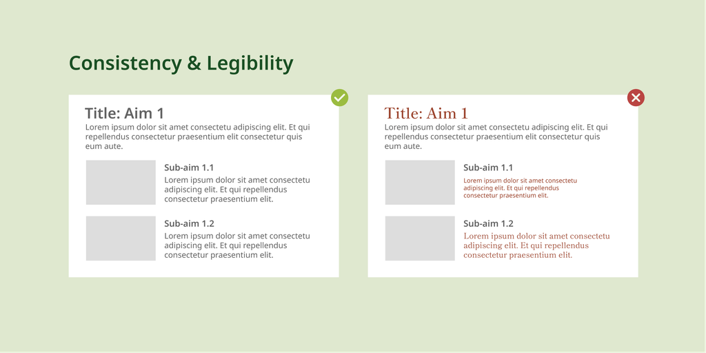
8. Maintain Font Consistency and Legibility
The Concept: Mixing multiple font families or shrinking text size creates visual noise and reduces readability.
How to do it: Stick to clean, highly legible sans-serif fonts (such as Arial or Helvetica) across all figure panels, matching the primary grant body font. Keep text sizes large enough to read easily printed at 100% scale, remember that many reviewers still print proposals on paper where zooming isn’t an option. Test your figures by printing a test page at actual scale.
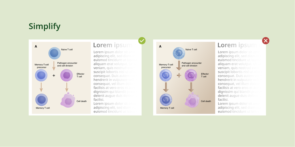
9. Simplify Symbols and Vector Icons
The Concept: Overly detailed or photo-realistic illustrations draw unnecessary visual attention away from the core narrative.
How to do it: Use clean, modern vector icons or simplified schematic shapes to represent equipment, cell types, assays, or workflows instead of hyper-complex, busy graphics.
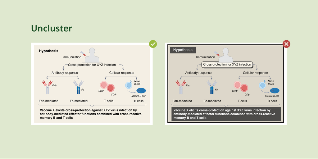
10. Eliminate Unnecessary Clutter
The Concept: Decorative design trends, 3D gradients, heavy dark borders, drop shadows, and dark background fills, obscure the underlying science.
How to do it: Strip away any element that does not actively explain your hypothesis or data. Replace 3D graphics with clean 2D vector layouts, remove dark background fills, and soften or eliminate background grid lines.
Ready to Elevate Your Next Proposal?
A clean, strategic figure can mean the difference between a reviewer wrestling with your narrative and instantly grasping your innovation.
Whether you need a custom graphical abstract, a mechanism-of-action diagram, or a complete visual overhaul for an upcoming grant deadline, PLOT My Science is here to help.
👉 Contact PLOT My Science today to discuss your project and turn your scientific ideas into clear, convincing visual assets.