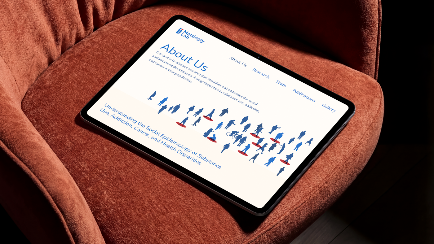
Mattingly Lab Website
A lab website that conveys the idea that addiction and cancer disparities are not merely individual choices, but are deeply intertwined with the environments, structures, and policies built into the world around us
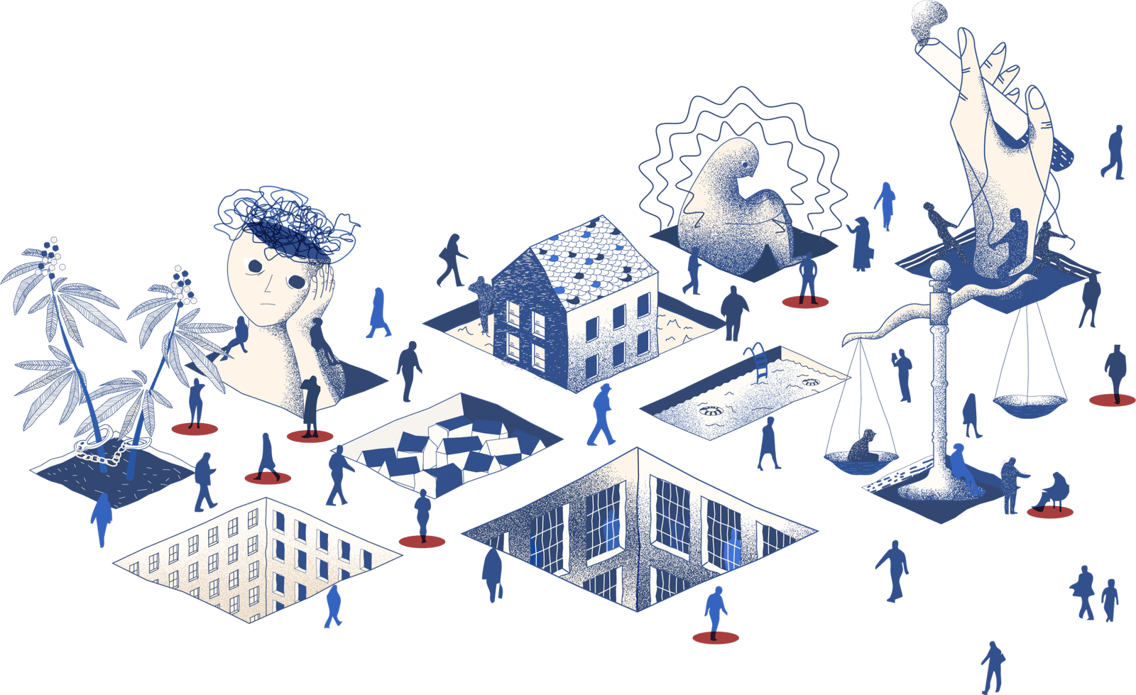
Society and grid
Instead of showing isolated individuals, we create illustrations that presents a landscape where people navigate a physical grid of societal, economic, and environmental pressures. Each “cutout” or isometric window in the ground represents a different layer of risk or structural influence that shapes substance use, addiction, and health outcomes. And some populations are more vulnerable than others due to these interactions.
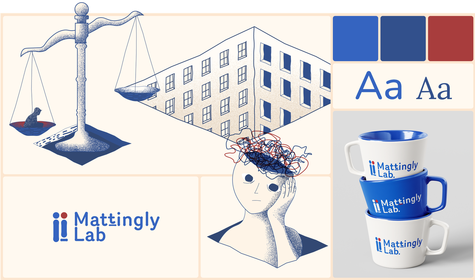
Human-Centered Design
We wanted the website and illustrations to feel inherently warm and approachable, which we achieved through a intentional color palette. The deep blue shades instill trust and reliability, while the brick-red accents evoke urgency and importance. To balance the clinical nature of research, a soft cream background adds a welcoming, human warmth, reflecting the very subjects at the heart of the lab’s mission, people.
Balancing rigor and humanity
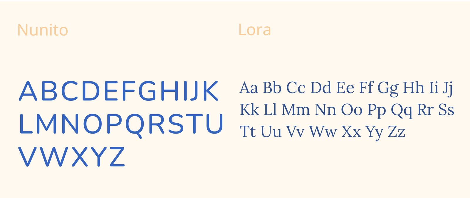
For a research like the Mattingly Lab, which studies the human impact of addiction, cancer, and structural health disparities, the visual identity needed a typographic that could bridge the gap between hard numbers and lived experiences. The typography chosen for the project achieves exactly that by striking a deliberate balance between academic and human-centered warmth.