5 Styles of design to launch your research lab website

Jacqueline Tida
7 min read
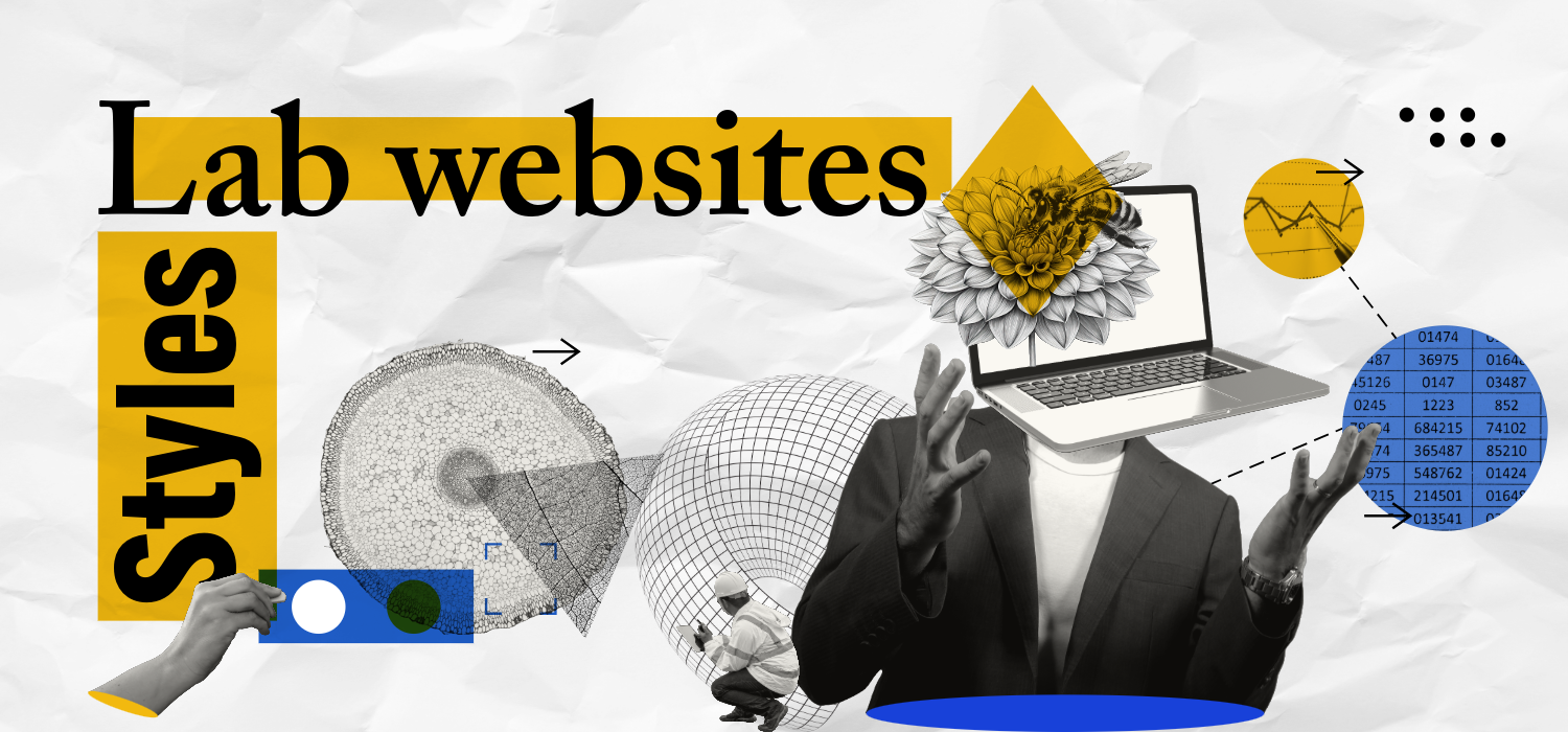
Build a website can be an arduous work and decide which style to choose can be trick. Maybe you have browsed and found some interesting layouts, but is not sure if this style will fit your lab website’s goals and culture. Before we dive in through the styles, we need to consider that a lab website mainly must to provide essential information regarding the lab contact information, lab core mission, research areas in investigation, and team members. So, the users must find this information easily. And the function of design for a website is simply to elevate and give priority to the content. In summary, a design for a lab website works to enhance the users experience and acknowledge of what your science is.
So, let’s go deeper and check five styles of design that can help your lab website look gorgeous!

1. Leveraging Realism Web Design for Your Lab Website
The realism web design style prioritizes high-quality visuals like photographs and videos to create a sense of authenticity and immersion. This approach is ideal for research labs where the focus is on showcasing the intricacies of physical specimens or research subjects.
For instance, a lab studying insects could utilize microscopic images or close-up photographs of anatomical parts. This visual storytelling allows visitors to grasp the nature of your research and its impact.
However, realism isn’t a one-size-fits-all solution. Labs focusing on processes or theoretical concepts might find this style less effective.
The key to a successful realism website lies in the quality of your visuals. Low-resolution or blurry images can undermine your credibility. Invest in high-resolution photography or videography to truly capture the essence of your research.
2. Exploring Digital Collage
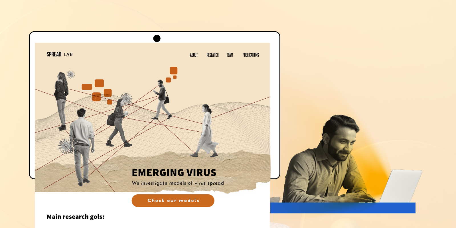
Digital collage, a vibrant artistic technique, involves assembling photographs, illustrations, and textures into visually striking compositions using digital tools. This approach offers exciting possibilities for research labs seeking to communicate complex ideas in an engaging way.
Unlike realism, which focuses on depicting real-world objects, digital collage embraces the power of surrealism. It allows for infinite combinations of imagery, textures, and colors, fostering a unique canvas to represent abstract concepts or processes central to your research.
For instance, a lab studying the spread of a disease could create a digital collage that visually depicts the interconnectedness of factors, or a lab researching artificial intelligence could use collage elements to represent the complex interplay of data and algorithms.
Here’s how digital collage can enhance your research lab website:
By incorporating digital collage strategically, research labs can transform their websites into captivating platforms that effectively communicate the essence of their work.
3. The Power of Illustration for Research Lab Websites
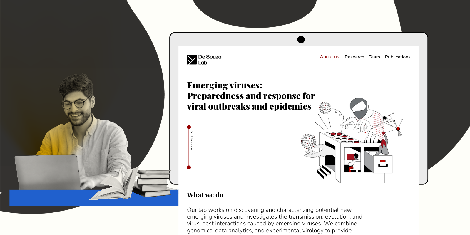
Illustrations are a powerful asset for research lab websites. They can effectively translate complex scientific concepts into clear and engaging visuals, fostering a deeper understanding for your audience.
Beyond standing out from the crowd: While stock photos and graphics have their place, custom illustrations offer unmatched flexibility in representing your unique research and lab culture. Illustrations can be tailored to perfectly align with your brand personality, ensuring a cohesive and memorable online presence.
Think beyond simple shapes: The beauty of illustrations lies in their versatility. By manipulating shapes, color palettes, and design styles, you can create a wide range of visuals that effectively communicate even the most intricate scientific ideas.
For instance, a lab studying protein structures could utilize illustrations to depict complex molecular interactions in a clear and visually engaging way.
By harnessing the power of illustration, research labs can transform their websites into informative and engaging platforms that effectively connect with their audience.
4. Graphic Patterns for Research Lab Websites
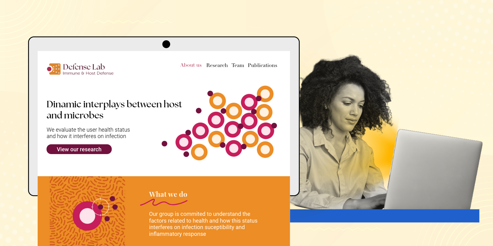
Graphic patterns are visual structures formed by the repetition and arrangement of elements like shapes, colors, textures, and even images. These elements can be anything from bold geometric shapes to organic details that evoke the natural world. In the context of a lab website, graphic patterns can be incredibly powerful tools for:
Adding some thematic to the patterns like your main research focus can not only add a unique flair to your lab website but also subtly communicate the nature of your science and connect with visitors on a different level.
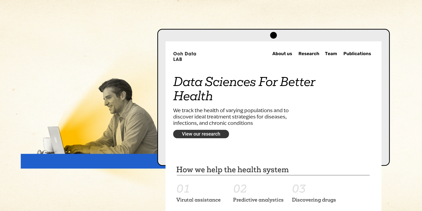
5. Text with Personality: Crafting a Lab Website with Typography
Even without flashy visuals, you can design a compelling lab website using typography. Fonts can communicate your lab’s essence and research goals just as effectively as images. By following core principles like readability, hierarchy, consistency, and understanding font style, you can craft text with a distinct personality and feel.
Even without images, a lab website can look amazing by following these simple rules when choosing fonts for your research website. By focusing on readability, hierarchy, consistency, and font personality, you can create a website that’s not only informative but also visually engaging and memorable for your visitors
Ready to find more inspiration
If you still looking for more inspiration for your research lab website, visit the following websites:
I hope this content has helped you find the best style to showcase your lab website. Have a project for us? Contact us !
